Principles of Design
The Principles are concepts used to organize or arrange the structural elements of design. Again, the way in which these principles are applied affects the expressive content, or the message of the work. The principles are:Balance

Balance is the concept of visual equilibrium, and relates to our physical sense of balance. It is a reconciliation of opposing forces in a composition that results in visual stability. Most successful compositions achieve balance in one of two ways: symmetrically or asymmetrically. Balance in a three dimensional object is easy to understand; if balance isn't achieved, the object tips over. To understand balance in a two dimensional composition, we must use our imaginations to carry this three dimensional analogy forward to the flat surface.

Symmetrical balance can be described as having equal "weight" on equal sides of a centrally placed fulcrum. It may also be referred to as formal balance. When the elements are arranged equally on either side of a central axis, the result is Bilateral symmetry. This axis may be horizontal or vertical. It is also possible to build formal balance by arranging elements equally around a central point , resulting in radial symmetry.

There is a variant of symmetrical balance called approximate symmetry in which equivalent but not identical forms are arranged around the fulcrum line.
 Asymmetrical balance, also called informal balance, is more complex and difficult to envisage. It involves placement of objects in a way that will allow objects of varying visual weight to balance one another around a fulcrum point. This can be best imagined by envisioning a literal balance scale that can represent the visual "weights" that can be imagined in a two dimensional composition. For example, it is possible to balance a heavy weight with a cluster of lighter weights on equal sides of a fulcrum; in a picture, this might be a cluster of small objects balanced by a large object. It is also possible to imagine objects of equal weight but different mass (such as a large mass of feathers versus a small mass of stones) on equal sides of a fulcrum. Unequal weights can even be balanced by shifting the fulcrum point on our imaginary scale.
 Whether the solution is simple or complex, some form of balance can be identified in most successful compositions. For a further discussion of balance in design see these sites:
Symmetrical balance
Asymmetrical balance
Proportion
Proportion refers to the relative size and scale of the various elements in a design. The issue is the relationship between objects, or parts, of a whole. This means that it is necessary to discuss proportion in terms of the context or standard used to determine proportions.
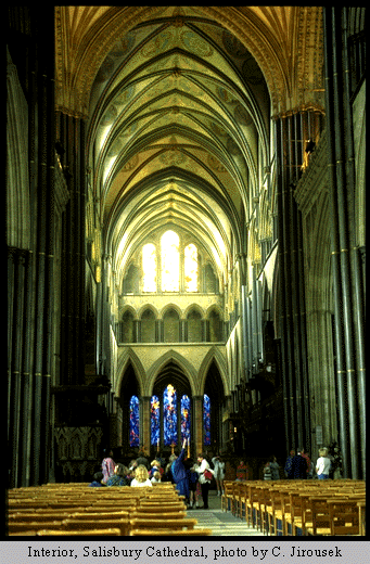 Our most universal standard of measurement is the human body; that is, our experience of living in our own bodies. We judge the appropriateness of size of objects by that measure. For example, a sofa in the form of a hand is startling because of the distortion of expected proportion, and becomes the center of attention in the room. Architectural spaces intended to impress are usually scaled to a size that dwarfs the human viewer. This is a device often used in public spaces, such as churches or centers of government. The same principle is often applied to corporate spaces through which the enterprise wishes to impress customers with its power and invincibility.
 In contrast, the proportions of a private home are usually more in scale with human measure, and as a result it appears more friendly, comfortable, less intimidating.

Use of appropriate scale in surface design is also important. For example, an overly large textile design can overwhelm the form of a garment or a piece of furniture.
A surprising aspect of proportion is the way ideal proportions can vary for the human body itself. Styles change in bodies as they do in clothing. Prior to the 16th century, for example, the female body ideally had large hips and belly. Only later was a small waistline stressed.
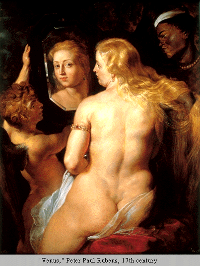
In the 17th century and many other periods, the ideal body was much heavier than we would accept today.
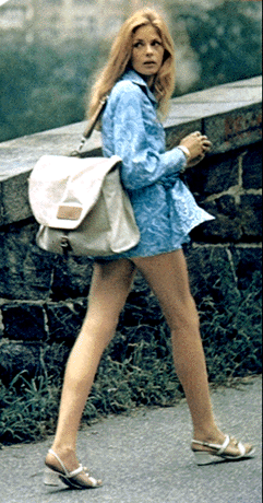
Of course, in the last 35 years the ideal personified by the fashion model has fostered a standard which idealizes exceptionally slender body proportions for women. In this century, sports have provided models for ideal male body proportions. Beginning with the rise of televised football in the 1960's, and the subsequent fitness boom, an increasingly exaggerated muscular silhouette, corresponding to that of the uniformed and padded football player, was presented as the ultimate male form. Only in this period could Arnold Schwartzenegger have represented the heroic ideal body image. This trend reached its most extreme form in the late 1970s and early 1980s. Since that time the emergence of basketball as the predominant American sport has led to a more naturally proportioned fit body ideal for men.
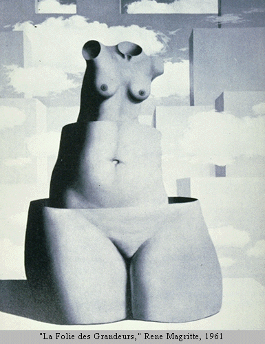
In addition, artists frequently take liberties with the natural proportions of the human body to achieve their expressive goals. A well known classic example is Michaelangelo's David, in which distortions of proportion are used by the artist to depict both the youthfulness of the boy David, together with the power of the hero about to conquer the giant Goliath. The surrealist painter Magritte often used distortions of proportions to create striking effects.
Check out the tutorials at http://char.txa.cornell.edu/
This lady always used to make me smile.
ReplyDeleteNice blog mate, you've got a new follower
ReplyDeletecool art analysis
ReplyDeleteI love this blog <3
ReplyDeleteGreat insight on drawing!
ReplyDeleteGood information. Can be used with website design as well. :)
ReplyDeletedef going to have to refer to this when designing my blog! i just kinda went with all the default design and i feel like it could use an overhaul!
ReplyDeletesweet that tutorial link was really good
ReplyDeletei love art like this! great tutorial
ReplyDeletegood to know great tips ty
ReplyDeletenice post, supporting you bro!
ReplyDeleteMost important thing about balance is that you can't just be aware of the positive space (the subject you're drawing), but you have to be aware of the negative space (all the blank area that surrounds it and creates its shape).
ReplyDeleteawesome blog and relevant to my interests :D!
ReplyDeletethank you for the info
Hmm I would personally add Simplicity to the list. I really prefer design that is succinct and to the point. I am not a fan of super complex or too much detail. Simple is good.
ReplyDeletewow helpful info. Great blog, you got a new follower!
ReplyDeletei'm not an artist, but those are good concepts
ReplyDeleteNice informative post buddy, looks like you spent alot of hard earned on this write up!
ReplyDeleteThanks
Nice post, i follow your blog...
ReplyDeleteNow if only I could draw...
ReplyDeleteI really like your blog, its very interesting and fun.
ReplyDeleteInterested about Phones and Technology ? Visit my website www.PhonesLand.net